Saturday, December 3, 2011
Wednesday, November 30, 2011
That pesky fourth image...
I am currently still in a debate, a quandary if you will, about my fourth image. "WHAT AM I GOING TO DO?!" has run through my mind a few times. I'm beginning to wonder if I shouldn't just wait until my photo shoot to determine what message my argument is still missing. Perhaps my lovely friends/models will provide inspiration.
To tell the truth, though, I hate not having all of the images already planned, but perhaps organic is the best way to grow the thought.
My images will require interpretation; the differences between the two characters of my presentation will be subtle; the viewer will have to think to determine where I am going with my message. In addition to that strategy, I am going to use juxtaposition of additional images on top of the images of my "models" themselves to encourage further thought.
Tuesday, November 29, 2011
Frustrations
After today's feedback I am, not surprisingly, unconfident in my subject choice. I was very confident in three of my image "visualizations" and the meanings that they carry; however, the fourth I am not completely sold on. I of course want to avoid illustration, but at the same time I am going to avoid ambiguity. To aim for ambiguity when attempting to persuade or make a particular argument is foolish.
I don't know what I'm going to do for the fourth one. And I am confused as to whether I'm supposed to have a specific argument or a broad argument, because the answer to this is quite important in my determination of that fourth image. It will make or break the slideshow. My original idea is a bit literal; that's why I wanted to avoid it, but I do not believe the other sketches are too illustrative; they leave room for interpretation.
I don't know what I'm going to do for the fourth one. And I am confused as to whether I'm supposed to have a specific argument or a broad argument, because the answer to this is quite important in my determination of that fourth image. It will make or break the slideshow. My original idea is a bit literal; that's why I wanted to avoid it, but I do not believe the other sketches are too illustrative; they leave room for interpretation.
Surprise, Surprise
Not only am I no longer pursuing the "cool hunting" topic I was originally considering for my final project, I am no longer pursuing the subject outlined in my storyboard either. After a very productive and beneficial conversation with my best friend, I have decided instead to tackle the subject of grading. Though my images will appear in a college context, the argument my photographs will make applies to all levels of evaluation, even perhaps into fields beyond education.
I will be making the argument that broad and generalized systems of evaluation, including but not limited to the lack of a plus/minus grading system, are inadequate. Yes, like everyone else in my graduating class at TCU I have been screwed at least once by the plus/minus grading system, but I also see the value of it and the possible benefits of the system for students. My images will seek to reveal this.
I am excited at the possibilities of my photographs, but after researching Ansel Adams I definitely feel a certain sense of ineptness, both in photographic skill (I have none) and in subject matter. To be honest I just foresee environmental advocacy being a tad bit overdone at the current moment. I hope mine will suffice.
Side note to peers: Don't hate me for arguing in favor of the current grading system. Trust me, I get it. And two weeks ago, I never would have thought that I would make the argument that I am. Just for what it's worth...
The Great Ansel Adams
The fact that Ansel Adams's works, though landscape, black-and-white photographs, are still so popular and appreciated in contemporary society reveals much about our current generation, and perhaps reveals what we most lack and desire.


Tetons and Snake River
Ansel Adams was an American photographer and social activist whose black and white landscape photographs have maintained their presence and popularity in modern culture. Adams co-developed the Zone System, which is a process of determining proper exposure and adjustment of the contrast in a print. This process is responsible for Adams’s images’ characteristic depth and clarity. In addition, Adams preferred to use large-format cameras, despite the labor they incurred, because of their high resolution and resulting sharpness (Alinder). Furthermore, Adams advocated for visualization, or the practice of planning an image and its aesthetic and mechanical elements before taking a photograph (not unlike the approaches we have used for this class).
Clearing Storm, Sonoma County Hills
Adams photographed both close-ups and large forms, like mountains and factories. When in the 1930s many other photographers adopted the opinion that “they had a social obligation to reveal the harsh times of the Depression through their art,” Adams began to use his artistic capacities on behalf of wildlife preservation (Alinder). The infringement upon the natural settings of Yosemite National Park in particular inspired many of Adams’s shots. The next decade, Adams’s contracted with the federal government to photograph other national parks, reservations, and other similar locations. During this time, Adams discovered another social crisis arising in American culture: the confinement of Japanese Americans. This conflict became a new subject for Adams’s photography in addition to his other various photographic subjects as determined by the Department of the Interior.
Northern California Coast Redwoods
Though he used his images to advocate for several different causes, Adams has one constant, clear approach to making his arguments: the simplicity and clarity of his photographs. Adams spent his entire career perfecting the mechanical tools he used to develop his images, simply so that his images were as sharp, as deep, and as profound as the live views themselves. He realized that the scenes he sought to share with others were powerful enough in and of themselves, so his task was purely to convey them as realistically as possible.
Alinder, Mary. Ansel Adams: A Biography. New York: Henry Holt and Company, 1996. Print.
Wednesday, November 9, 2011
New Beginnings
And yet another new project begins, bringing with it new beginnings of brainstorming and thought...
In the advertising industry, many professionals utilize a form of market research called "cool hunting." The first idea I had for this first project involves examining and critiquing such a concept and practice. If I pursue this option, my first idea is to base the project on my roommate, Lindsey, and her founding of TCU's Quidditch Club. I'm not spoiling the rest of the argument, though!
My next idea stemmed from our class discussion about store windows and displays, and I have considered using such set-ups as a model for another point I would like to make. I have several topics of "discourse" to which this examination could apply, so this idea is also still very much in the works.
Other ideas I have had, which are even less developed than the aforementioned, stem from religious icons, uniforms, and the color red. (And yes, several of these ideas came directly from class conversation, but I have every intention of taking these in different directions.)
Ancap & Ad Design

On a basic level, the ad utilizes the commonly recognized symbol of star grades to reveal the safety, or lack thereof, graded by the company. In addition, the image uses a realistic setting, characters, and vehicle to inform the audience of the reality of testing cars and the practical standard of assuring a vehicle’s safety.
On an emotional level, this image appeals to its viewers’ sense of fear. The thought of a car as unsafe as the one implied in the ad, a car so unsafe that a dummy would be terrified, successfully conveys the importance of the auto safety company’s work. This image also uses comedic appeal. The hilarity of the dummy clinging to the pole, and the man’s attempt to get the dummy to let go, are humorous and unexpected images that catch and retain the audience’s attention and lead them to think twice about the message.
The first of the appeals to credibility, and a classic example of such appeals, is the presence of the tester’s white lab coat. Though in jest, this instantly gains the viewer’s trust of the “professional” depicted. And in addition to the logical function of the realistic elements of the image, these various elements also lend the image a further sense of credibility. Their presence makes the message more credible and believable in its similarity to reality.
Wednesday, November 2, 2011
Reform TCU
The new site, Reform TCU, is up and running! Check it out, and see if you agree with my proposed modifications of TCU's tuition policies.
http://student.tcu.edu/rebeccaaallen

http://student.tcu.edu/rebeccaaallen

Tuesday, October 25, 2011
The Grind
I'm getting into the grind on this Reform TCU site. I was excited about my proposal and my ideas for the site, but after seeing many of my classmates' pages in class, I'm suffering from a major self-confidence crisis. On the bright side, props to my classmates for an awesome job!
I am not too worried about content; I have a lot of faith in the relevance of my topic and the supporting information I have found. I am worried about my page itself and its design. My biggest fear is that it will seem amateur, but truth be told it is. I have no idea what I'm doing in Dreamweaver. The closest sensation I can associate it with is groping around in the dark, and after a lot of frustrating time I might eventually find an answer.
How do you stay motivated in piecing together large projects? Do you have any tips for helpful information or insight in web design?
Stay posted for updates! (and perhaps a brighter outlook)
Thursday, October 20, 2011
Below are some photographs from TCU's image database that are serving as inspiration as I draft photos for my upcoming website, which will advocate a specific reform at TCU.


As we discussed in class today, photographs should have rhetorical meaning, and in the context of my prospective reform, images similar to those above will carry meaning relevant to my ideas. My topic, increased tuition rates and possible buffers for TCU families, is not very conducive to images of people. However, several of my original concepts for photos included elements utilized by those above. Such images will reinforce the fact that such issues and their reform affect the campus as a whole.
On a lighter note, after today's class I am feeling much, much better about my website. It still has very little on it, but many of the technical issues I was having have been explained, and I am finally able to go about modifying the site's elements.


On a lighter note, after today's class I am feeling much, much better about my website. It still has very little on it, but many of the technical issues I was having have been explained, and I am finally able to go about modifying the site's elements.
Tuesday, October 18, 2011
"Personality in Design" & Dreamweaver
Aaron Walters posted an interesting article, an excerpt from his book titled Designing for Emotion, about always remembering the "human element" necessary in design. This connection is required in order for any sort of image, argument, or other persuasion attempt to hope to successfully reach an audience.
I am hoping to integrate this concept in every level of my website's design. Walters examines specialists in human-computer interaction, and he refutes the application of their approach. Instead, he advocates for human-human interaction, if you will.
And for those of you interested in my progress on my latest project, the aforementioned site advocating for my proposed reform at TCU, I have the basic site set up! Not a big step or accomplishment (well, it is for me), but certainly the first and most critical step!
I am hoping to integrate this concept in every level of my website's design. Walters examines specialists in human-computer interaction, and he refutes the application of their approach. Instead, he advocates for human-human interaction, if you will.
If we’re doing our job well, the computer recedes into the background, and personalities rise to the surface. To achieve this goal, we must consider how we interact with one another in real life. (para. 4)Keeping these principles in mind will perhaps make my arguments for reform in TCU's tuition policies stronger and more effective, and perhaps in turn, persuasive.
And for those of you interested in my progress on my latest project, the aforementioned site advocating for my proposed reform at TCU, I have the basic site set up! Not a big step or accomplishment (well, it is for me), but certainly the first and most critical step!
Sunday, October 16, 2011
Affordability and Tuition Reform
If you would like to read the original research on which I am reflecting, please read this article.
Three researchers, Catharine Hill, Gordon Winston, and Stephanie Boyd, evaluated the financial records for twenty-eight highly selective private universities to evaluate financial aid policies. Specifically, they focused on the records, prices, and costs for the 2001-2002 school year. They found that price as a fraction of family income is higher for lower-income students. They concluded that a school’s wealth heavily influences its pricing policy and the equality it is capable of extending to students across all socio-economic statuses.


Though I could easily argue fervently in favor of financial reform without objectively examining such policy decisions, for my argument to be effective I have to understand all of the considerations influencing TCU’s financial policymakers, not just those that I, as a student, witness and have experienced.
Three researchers, Catharine Hill, Gordon Winston, and Stephanie Boyd, evaluated the financial records for twenty-eight highly selective private universities to evaluate financial aid policies. Specifically, they focused on the records, prices, and costs for the 2001-2002 school year. They found that price as a fraction of family income is higher for lower-income students. They concluded that a school’s wealth heavily influences its pricing policy and the equality it is capable of extending to students across all socio-economic statuses.
This article will prove very beneficial to the reform I would like to suggest at TCU. The researchers of this study were very thorough in presenting their information and informing their readers about the considerations and practical knowledge that influence pricing policy at universities. This quasi-introduction to this area of study is necessary for my own examination of TCU’s current policies. Furthermore, this article expanded my understanding both of TCU’s present practices and of those exercised by other universities around the nation.
I find it interesting, though not necessarily surprising, to see that “the lowest income students pay the largest share of family income” (Hill, Winston, & Boyd 778). Though these students may receive the most aid, this aid does not necessarily lighten the burden on their families to finance the expenses of college. This truth is a key concept that, I believe, many colleges must not fail to recognize and integrate into their policy decisions. Universities must realize that the total cost alone or the total percentage covered by the college alone is not the issue; families must be able to fit such an expense into their budgets. Even if they have received a sizeable percentage off of the sticker price, the final price may still be near impossible for them to responsibly manage.
I find it interesting, though not necessarily surprising, to see that “the lowest income students pay the largest share of family income” (Hill, Winston, & Boyd 778). Though these students may receive the most aid, this aid does not necessarily lighten the burden on their families to finance the expenses of college. This truth is a key concept that, I believe, many colleges must not fail to recognize and integrate into their policy decisions. Universities must realize that the total cost alone or the total percentage covered by the college alone is not the issue; families must be able to fit such an expense into their budgets. Even if they have received a sizeable percentage off of the sticker price, the final price may still be near impossible for them to responsibly manage.


Hill, Winston, and Boyd also examine the influence of schools’ wealth on their pricing policies, declaring that “more wealth supports larger general student subsidies and those subsidies act, in turn, much like a wage payment to students for peer quality” (780). The problem, however, is that such policies can, and do, easily perpetuate inequality in the opportunities presented to lower-income students, because a well-known positive correlation exists between academic quality and family income.

Though I could easily argue fervently in favor of financial reform without objectively examining such policy decisions, for my argument to be effective I have to understand all of the considerations influencing TCU’s financial policymakers, not just those that I, as a student, witness and have experienced.
Friday, October 7, 2011
The Razzies and Oscars: The Worst and the Best in Web Design
The worst of the worst and the best of the best... At least relatively speaking.


As I would hope is evident, the above two sites are two examples, I think, of well put together websites. I find both of them visually appealing as well as easily navigable, two qualities difficult to balance in web design. Ads, if present, are minimally intrusive and blend well, and the layout is clean with unique touches.


The above two sites are my examples of weak or otherwise ineffective web pages. Many may be surprised at my choice of Amazon. I can explain! While I definitely give props to all that the company does behind the monitor, I've always found the website cluttered and distracting. It lacks any sort of balance between text and image, so there's too much of all of it. The TCU Bookstore page, which then goes on to link to the other TCU Bookstore page (?!), is almost too simple. Its navigation seems simple, yet the categories are not always relevant, and the content of the page is scarce.
Thursday, October 6, 2011
Agitation and Reformation
In preparation for our latest project, I'm beginning to mull over reforms that I would suggest (and be able to build a case for) at TCU. My favored idea at this moment is a proposal to grandfather students' tuition rates to those contemporary with their initial enrollment, essentially locking students into the tuition rate at which they begin full-time, undergraduate study.
A small handful of schools currently have policies set that allow such tuition freezes, but they come with a fee. Would such a measure be so drastic for universities?
This question will guide my ensuing preliminary research. Before I can build my case or present reformation measures, I have to determine its viability. I'll also have to discover the advantages presented by such changes. Administrators won't just change the status quo without compelling arguments and perceived advantage.
I have faced such tuition increases two years (2010-2011, 2011-2012 ) in a row, and I fully anticipate another increase. The difficult aspect to swallow is that the rate of increase is not even steady; this, too, has increased each subsequent year.
Confessions of an AD/PR Major
I'm beginning to face a dilemma; I would call it a duality of perception. (Note: I have yet to decide if it is an acceptable or negative thing.)
As a human being, I am becoming increasingly aware of the lack of privacy in society, with digital technology increasingly infringing on my personal information and doings. On the other hand, as a student of advertising and public relations, I spend my free time learning more and more about cutting-edge technology and the hottest trends in the online realm. I find these advances fascinating, yet on a personal level this genius seems to step into an eery light.
Perhaps as a society we've become alienated from ourselves and our abilities to connect with others, so these online forums for networking, sharing, and expressing are an appealing channel for such activity. Activity that I would argue is a common and essential form of relating to others - a vital dimension of human development.
But this leads me to another question, how did we first become so disconnected? Many argue that technology and the rise of the digital realm is to blame. Wouldn't the conjunction of the latter observation to the former create a contradiction?
What do you think? Why has the digital revolution been so revolutionary to culture? What element of the human experience did it introduce or alter, and why is that element so necessary?
And for you infographic lovers like me, check this out!
Oooooh Check it Out!

With the smart phone I'm sure that you have within six inches of your keyboard, scan this QR code to see what I'm up to and how you can make the cliche-but-nevertheless-true difference in the global community of which you are a part.
If you've seen any of my earlier posts, I am trying to raise money for famine relief in East Africa through Operation USA. Operation USA is a non-profit agency with a unique advantage. They have their own planes which they can load with aid (like food) and drop into countries in which on-the-ground efforts are prohibited. I am participating in this fundraising attempt with my fellow TCU classmates in Multimedia Authoring, a course focusing on the rhetoric of image.
In case you need more background, East Africa is suffering from a severe drought, and its resulting famine, which is compounded with civil strife and warfare. Many refugees are trying to flee, with opposition, from Somalia into nearby Kenya. Both countries, along with their neighbors, need help in supporting and maintaing their refugee camps of hundreds of thousands.
Even if you aren't sure that you have anything to give, check the page out and find out more about what we're doing.
Wednesday, October 5, 2011
Generations of Web Pages
Unlike people, a web page's generation is no indicator of its age. Rather, generations describe the attributes and general design of the site -- its purpose, intentions, and values as indicated by its overall composition. Below, I display examples of varying generations of websites and my brief thoughts on their design as it relates to their classification.
First Generation:


First Generation:
I categorized this website as a first-generation website because of its reliance on basic headlines and edge-to-edge text. The page utilizes few images and linked icons. The text on this page was moderately long by web standards. Basically, this site is text-heavy with little use of graphics, videos, and other types of multimedia. The page simply relies on basic web page coding.
Second Generation:

I consider this page a second-generation site because it closely resembles Siegal’s description. The page is in many ways similar to the first page, but it does integrate more images, some of which are internal links, and the button-function of certain graphics is displayed. This page also attempts to use lists and bullets to organize its points as well as navigation menus.
Third Generation:

TCU 360 is a third-generation website because its objective as a source of news to its audience is clear in its design. Emphasis on the site’s design to promote usability and understandability is clear. The design is appealing so as to draw in the viewer, and the “who,” “what,” and “why” of the site is also evident. The navigation of the site, an important component of usability, and its structure are also simply and elegantly designed.
Fourth Generation:

This site immediately came to mind for a fourth-generation web page, particularly its inclusion of “all the bells and whistles.” The icons on the screen move around and music plays in the background. This site offers its visitors the opportunity to shop for products, schedule appointments, and find particular locations. The purpose of the site, like the third-generation site, is evident, as the company’s purpose is very much evident in the site’s design.
Tuesday, September 27, 2011
"Demystifying Design" and the Novice
http://www.alistapart.com/articles/demystifying-design/
In his article "Demystifying Design," Jeff Gothelf examines the mystification of the web designer realm of expertise. He advocates for design's "demystification" in order to promote collaboration and understanding between designers and "non-designers." He also argues that this will potentially increase the valuation of designers and their work, rather than diminishing such reverence as some designers might fear.
Gothelf outlines several specific strategies for beginning this process of "demystification," and these steps sound familiar to a web design novice, as I would imagine many of us are. His first approach - sketch. Such drafting, as we have utilized in class, "is something everyone can do" that levels the playing field. He then recommends sharing these raw ideas and capitalizing on such opportunities for weighing in on the direction of an organic project. Gothelf then goes on to recommend addressing and justifying alterations and changes made to a particular design; this act promotes conversation, collaboration, and constructive criticism, which ultimately elevates the design process as a whole.
Interestingly, Gothelf then highlights the value of transparency, allowing others to see the current work, their motivations for those actions, and eventually the outcomes. This valuable strategy further highlights the value of blogging within this course. These blogs have the potential to allow us, as novice designers, to be transparent in our educational journey and acquire credibility in our own right.
These strategies, Gothelf urges, will only serve to increase the value of the design field, not hinder or diminish it. His suggestions also reveal the foundational truths and practices at the base of this field, further cementing the core values we have already discussed and implemented in class.
Saturday, September 17, 2011
Just a-bloggin' and collagin'
Well, today is the day. Today is the day that I begin actually assembling pieces of an until-now-theoretical collage. Staring at a big, white, blank 20x30 board is one of the most daunting feelings. Time to get started!

Some of my various "materials":
 Things become so much trickier when it becomes concrete and tangible. I'm currently trying to calculate measurements for each element of the board, so I can map it out and have an idea of the location for each piece, but I wonder just how accurate each of my projections will prove to be...
(And for those who are curious, smashing that clay pot you see into pieces was indeed quite fun, although a little scary, too.)
(Elapsed time 15-ish minutes...)
Here is one of my first photo edits, using a picture I found online:


Some of my various "materials":

(And for those who are curious, smashing that clay pot you see into pieces was indeed quite fun, although a little scary, too.)
(Elapsed time 15-ish minutes...)
Here is one of my first photo edits, using a picture I found online:

45 minutes later...

There are others, too. They just aren't quite ready yet...
Later that day... The board! Kinda...

I was very pleased with the textured spray paint I chose. Just my own personal opinion, but I believe it added depth to the board itself in addition to my original intentions for it -- to show the duality and juxtaposition of the elements that have yet to be added. (That might make a bit more sense once you see the rest of the board.)
Late that night... (And just for the record, I have not been working on the project this entire time. I'm doing pieces at a time, with breaks for other stuff in between. I just wanted to attempt to blog throughout the entire process as things come together.)
With that I would like to add that so far I am very excited about how my different elements are coming together!
A few updates:


At this point these pieces of the project will remain mostly as they are until critiques on the draft in class on Tuesday, so I'll end my blog journey here. I can't wait to share my collage!
Tuesday, September 13, 2011
Unity, Unity, Unity!
In class discussions and my own personal reflections on the project, I can't seem to get past my own need for the piece to be unified. Collages and other such graphic designs can so easily become ineffective and virtually illegible.
Previously I have written about my desire for organization within the actual structure of the entire board. Today's discussion of color in class added a new dimension to my thoughts on how to avoid chaos. I have yet to decide if I am going to utilize the effects of black and white images with color spotting, but I am certainly planning on altering the contrasts of the included images so as to unify the aggregation of images but also to focus each individual image.
I used to love black and white photos with one color retained. One year in college I even applied this effect to my favorite photos, which all hung on the wall in my room. However, whether through personal preferences or otherwise (I have no idea), I came to this point of finding the starkness of black and white and one single color too absolute, and almost cliche. I still see the beauty in it, but for a crisis as complex as that carrying on in East Africa, there are no absolutes. There are no set expectations, and there is no certainty.
In addition to these thoughts on black and white, I might ought to admit that I often dislike blending color images with black and white. Perhaps if one single image were in black and white and the rest were in color, or the reverse, I would easily understand that a specific argument is being suggested, but I am slightly adverse to using both approaches to images often.
Monday, September 12, 2011
The Enemies of Compassion
According to Joan Halifax, pity and moral outrage are the enemies of compassion.
This idea is particularly challenging in beginning to create my collage. How do I filter out the pity and stereotypes and retain the true compassion?
I suppose in struggling with this question it would be beneficial if I had a solid understanding of what pity truly is, but I wonder if I do. So, I did the best thing I could think of; I looked up the definition of "pity."
First, I got the following dictionary in the basic search on my computer:
"the feeling of sorrow and compassion caused by the suffering and misfortunes of others."Then, my search on dictionary.com drew the following results:
"sympathetic or kindly sorrow evoked by the suffering,distress, or misfortune of another, often leading one to give relief or aid or to show mercy."
"a cause or reason for pity, sorrow, or regret."
From these definitions I'm not entirely sure that I understand why pity is so negative. I know that often those who are the recipients of pity would prefer not to receive it, but isn't this often only to the point that pity does not lead to some sort of initiative? Or, in other words, isn't pity acceptable if the sentiments it stirs are converted into action?
As Halifax quotes, "It takes a strong back and a soft front." Surely pity is merely a mechanism of the "soft front" that activates the "strong back."
(I would love to hear your ideas on this matter; I really would.)
Nevertheless, I will strive to avoid stereotypes in creating my board. I want to utilize the full power of pathos and ethos, but I do not desire to manipulate the suffering of the East African people to that end. There must be a delicate balance between the two; finding that line will be challenging, though.
Tuesday, September 6, 2011
It's All Greek to Me
I can still fondly recall the high school classroom in which I first learned about the concepts of ethos, pathos, and logos. (They sound like the Three Musketeers to me.) And though I understand the concept, and have finally managed to remember the definitions for each, I find it difficult to evaluate thoughts and accurately categorize them by their correct persuasion. I always manage to start reasoning in circles until I eventually give up the pursuit.
 Now, I'm trying to figure out how to best include all three persuasions into my board design. To be frank, with the particular purpose of our project, I feel like pathos is a given. Even an attempt at objectivity will bring with it images that ought to unsettle any person's mind. (If you don't believe me, Google "East African Famine" under the "Images" function.)
And at the same time, it seems to me that ethos ought to be inherent as well. Seeing what we see, whether distorted or not, ought to appeal to our innate sense of morality. How can we have what we have and yet cling to it so selfishly and apathetically?
I'm still trying to work out the logos. Logically, we have so much, and giving out of our surplus is so simple that it seems illogical not to follow through on our capabilities.
I'm still mulling over these ideas. I would really love to hear what you have to say about any or all of these three concepts and/or how they function in relation to our project.
Sunday, September 4, 2011
...In the eye of the beholder.
Beauty is not the only thing in the eye of the beholder.
In fact, persuasion itself is in the eye of the beholder, and this reality gives much power to those who create and produce what we behold. Inevitably, these creators' perspectives dictate our own perceptions. As Ocepek states in the "Images" chapter,


In fact, persuasion itself is in the eye of the beholder, and this reality gives much power to those who create and produce what we behold. Inevitably, these creators' perspectives dictate our own perceptions. As Ocepek states in the "Images" chapter,
"All pictorial representations, even those that appear to be 'realistic,' reflect the artist's point of view" (63).
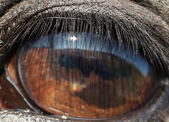
I tried to find some different images with intriguing points of view. What do you think about them? What perceptions or ideas do you think each respective photographer is trying to communicate to each viewer?
The resonance and persuasion of point of view in images is potent. In discussing this concept in class, I realized how vital it is to place the impetus on our audience, those we hope to persuade to donate to our food collection. A powerful method of accomplishing this is pathos, which point of view can easily add to an image or collection of images. I hope to use one greater image, one that will supersede all others that are a part of my collage, that's primary weapon is a point of view that draws my audience in, that makes that viewer feel like he or she is actually present to witness the suffering of the East African people. My desire is to convince him or her to act, and I hope to do this by locating or creating an image that possesses a subjective perspective that will compel its audience.
Below are two different commercials from the 2008 elections. Barack Obama endorses one against John McCain, and John McCain endorses the other against Barack Obama. How do you think these videos make use of point of view and perspective, both in the literal images they show and in the sub-text of their script and address? Do you think there is a difference in the tools used by the two ads, or do they function much in the same way?
True Collage
My immediate concept of a "collage" is my middle school notebook. It was covered in words and quotations and celebrities and cartoons, all arranged meticulously so that no empty space showed through, and clear tape went over the top to keep it all down. (A small part of me is hoping that some of the girls in the class remember what I'm talking about; at least at my school, it was the popular mode of decoration.)
Because of the image I have now associated with the idea of "collage," I have a difficult time realizing that in fact collage is much more than the gaudy magazine pages I spliced together. And again, because of the semi-negative perception I have of collages, though I am working to break down those misconceptions, I have decided that my collage for this project must have a tangible, obvious sense of structure.
Confession #2: I was really trying to avoid talking in depth about my collage on here. I know that's silly, but blame it on paranoia or competitiveness or whatever, but I don't want anyone to steal my idea. Of course, typing that statement I realize just how silly it is. All of you have just as much integrity as I do, if not more, and you all have just as much creativity as I do, probably more, so you have no reason to want my ideas anyways.
I plan on making several different collages, one in each of the giant letters "D-O-N-A-T-E." I have already figured out that in one letter I would like to make a collage of food packaging waste -- bottle caps, can tabs, wrappers, etc. This particular element of my board I am hoping will convey the reality of how much food we have and consume on a regular basis, nearly moment-to-moment, and through this, I hope to motivate people to donate out of their surplus.
In class on Thursday I also had another idea. Anyone familiar with The Hunger Games? (It's coming out in theaters!) Anyways, I am considering working that theme into the design, too, both on a symbolic and literal level. The literal level should be at least partly obvious - the people suffering in East Africa are hungry, starving. Symbolically, they, too, like the characters in the book, are being denied aid and relief by their own government. It might seem like a little bit of a stretch, but I'm still working it out in my head.
And for those of you interested in the movie, the trailer is below! :)
Tuesday, August 30, 2011
We are living in a digital world...
...and I guess that makes me a digital girl.
Amidst seemingly endless cracks about the innate tech savvy that seems to dwell in "digital natives" (a.k.a. the millennial generation), I find irony and comedy in the connection between digital functions and biological processes. The foundation of the digital world (and perhaps the least known and understood by the general population), binary coding, series of 0s and 1s that control every function a computer performs, are strikingly reminiscent of the neurons within our brain, as Professor Murray suggested in class.
To be frank, this realization immediately struck me, in part because of the Twilight Zone-esqueness of this conclusion. I find at least minimal comfort in recognizing that such similarities are not relegated to binary and neural coding alone. The all-or-none principle, both in a physical and metaphorical fashion, is applicable to other phenomena and behaviors in the world around us. How many classroom posters and coaches' speeches have emphasized that you must give a goal or objective all you've got or you might as well give none? All or none. You're in or you're out. The digital world, relying on computations and formulas, merely refuses to admit the presence of anything outside of its discrete calculating capabilities. In the wise words of Yoda, "Do, or do not. There is no 'try.'" Clearly our brain's neurons got that memo, too. Send/Receive or don't. I digress.
As a result of the connections my own personal brain functions were performing during class, I have come to a new understanding of what is analog and what is digital, and I have a newfound respect for both - for their capabilities, their weaknesses, and their relationship with one another.
We are all digital. Well, in the likeness of digital.
Actually, we came first. The digital world's foundation is in the likeness of us.
Saturday, August 27, 2011
The Metaphor of the Desk

vs.

It strikes me as ironic that perhaps some of the most revolutionary discoveries of the present generation are, either in form or concept, in fact not new at all. Plays and other live performances became films and videos. Written correspondence became real-time, verbal conversation. Paperwork became backlit images. The physical desk became a digital interface, capable of holding and displaying far more than a wooden or metal stand could hope to exhibit.
The theme of remediation imbues many aspects of my generation. Even in concept, how many remixes and covers of already released songs do we enjoy, as if they were our own creation? How many films do we enjoy that are merely remakes of our parents' favorites? Styles of past decades return to the fashion scene with every new season. We recycle ideas. But furthermore, and most clearly, we remediate the tools and entertainments of decades and centuries past. Literally. New media have furthered the way in which we are able to enjoy games and performances and the ways in which we execute our work and day-to-day tasks. New media have certainly increased the extent to which we are capable of doing these things, but I ask you, have they bettered these processes? Or, have they merely changed them?
Some would suggest, I am sure, that we are missing great intangibles by turning solely to new ways of doing things. As is usual, my money is on the happy medium - utilizing older, "traditional" media in addition to the new.
Subscribe to:
Posts (Atom)